It’s 3am. Do you know, exactly, where your data is?
Which vendors receive or touch your data?
What type of data each vendor is involved with?
Startups and software move fast. Pretty soon the SaaS and vendor integrations pile up. Security and Privacy implications are real but invisible, versus the actual connections over which your company’s data is flowing.
Thesis: you need to maintain a living map of your SaaS and vendor integrations, otherwise you don’t actually understand your data tenancy or security.
Ask yourself, at your company do you know who owns the list of all vendors and data flows? “I think someone knows…” “We could pull that together…” “It exists somewhere…” You’re already behind.
If you’re in a regulated industry or in a high expectations contractual space with customers, not having this data integration map is a risky way to operate.
- Security
- Data movements
- Blast radius
- Privacy and Data Governance
- Where is PII/PHI flowing?
- Subprocessors (approval and reviews)
- Data retention + deletion obligations
- Compliance & Customer Trust
- SOC2, HITRUST, HIPAA, PCI, etc.
- Enterprise security questionnaire: “List all your subprocessors”
Without the data integrations map, you’re running a structural risk not just an operational inconvenience.
Data Integrations Graph (DIG)
Yes, ‘graph‘ as in the discrete mathematical sense. A visualization with nodes and edges. An xlsx, google-sheet, or table simply isn’t going to cut it.
- Nodes: your systems, vendors, SaaS tools, data partners
- Edges: direct connections and data flows between Nodes
And a clarification: Data Flows vs. Data Integrations (and why this matters). The DIG can extend the idea of a formal Data Flow Diagram (DFD) beyond your own systems and services, to include every external system your data might touch. This is where most companies lose visibility.
Codify
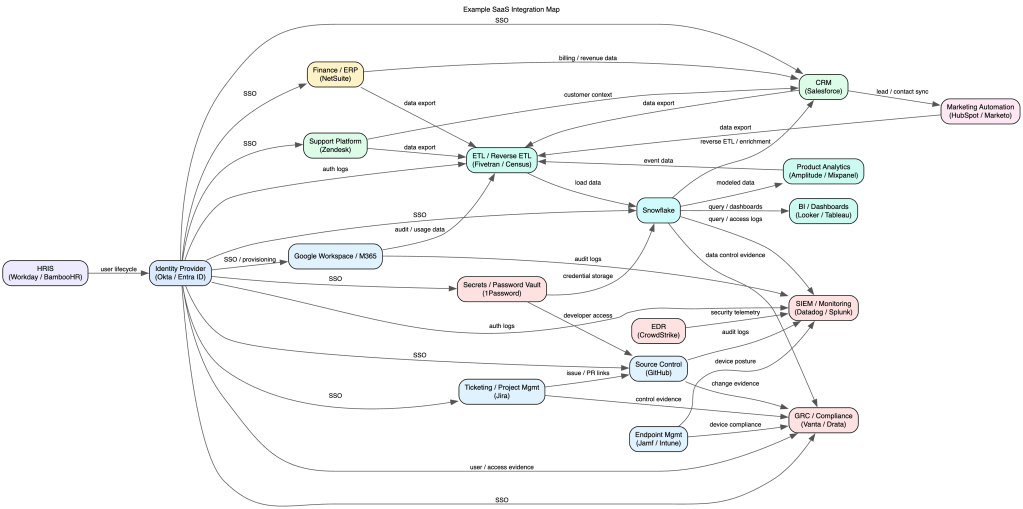
As mentioned above, a spreadsheet can’t convey the graph. Instead use a lightweight syntax like Mermaid, graphviz, or D2. (There are many many many online renderers for graphviz. And if you have a high security environment, you’ll want to download and run graphviz within your network to mitigate the chance of publicly leaking the graph.) See basic and complex examples in graphviz syntax. (Generated pics below.)
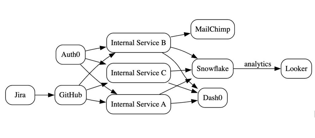
The graph may become complex visually. Rather it’s the code/syntax definition which is meant to be referenced (i.e. control-F for all mentions of a node) and not for the sole purpose of visualization generation. (But visualizations _are_ fun.)
Living Document
This is not just a “generate once” and now we’re done. Put the graph under source control, assign an owner, and involve processes and teams to ensure it stays up to date.
- Reviews: annual or quarterly for network or inventory
- Incident Response: understand blast radius quickly
- Shadow IT discovery: cross-check against other inventories or reality
- Vendor / SaaS acquisitions, reviews, and offboarding
- Threat Modeling
- Data Flows: use the graph to inform the flow diagram
CTA
Start small (pick 5-10 systems), map the integrations, put it in source control, and integrate into regular company processes.
You don’t need a perfect graph. You need a living one.
The companies that win on trust aren’t the ones with the most policies — they’re the ones that actually understand their systems.
